In Conversation with Rebecca Ward

Rebecca Ward, 2025. Photo by Weng Yee Mooi.
Rebecca Ward (b. 1984, Waco, TX) currently lives and works in Brooklyn, NY. She received a BA at the University of Texas, Austin, TX, and an MFA at the School of the Visual Arts, New York, NY. Selected solo exhibitions include SITE Santa Fe (2022) and FLAG Art Foundation, New York, NY (2017). Public collections include The Hepworth Wakefield Museum, Yorkshire, UK; The Museum of Old and New Art, Tasmania, Australia; and the Dallas Museum of Art, Dallas, TX.
I had the pleasure of asking Rebecca about her latest exhibition at Peter Blum Gallery, how she uses geometrical elements to formulate patterns that create distinctive lines and shadows, what kind of statement she wants her art to make, and so much more.
UZOMAH: How has art influenced your view of the world?
REBECCA: I grew up in a small city in Texas and craved culture and experiences beyond my community. Now, I’ve been in New York for 15 years, and art has shown me that immersing ourselves in the ideas of others is essential—it teaches us new ways of being and constantly pushes us outside our comfort zones. It has allowed me to see beyond my immediate surroundings, both through my own work and the work of others.
U: How has your personal art process evolved since you first started? What personal insights have you gained about your art process over the years and through each exhibition you have created?
R: My creative process has evolved into something more organized and streamlined over the years. When I was younger, I thrived on experimentation. Everything felt like a possibility, and I wanted to explore it all. Now, I’m focused on a specific body of work, these dyed and sewn canvas pieces. But, I still aim to introduce new ideas and concepts, allowing the work to remain open. The process that I intentionally narrowed has gradually opened up again. With every show, I get a sense of what has worked well, and that reflection helps spur new ideas and take those into the next phase of my work.
U: When creating distinctive lines and shadows, how do you use geometrical elements to formulate a pattern throughout your art?
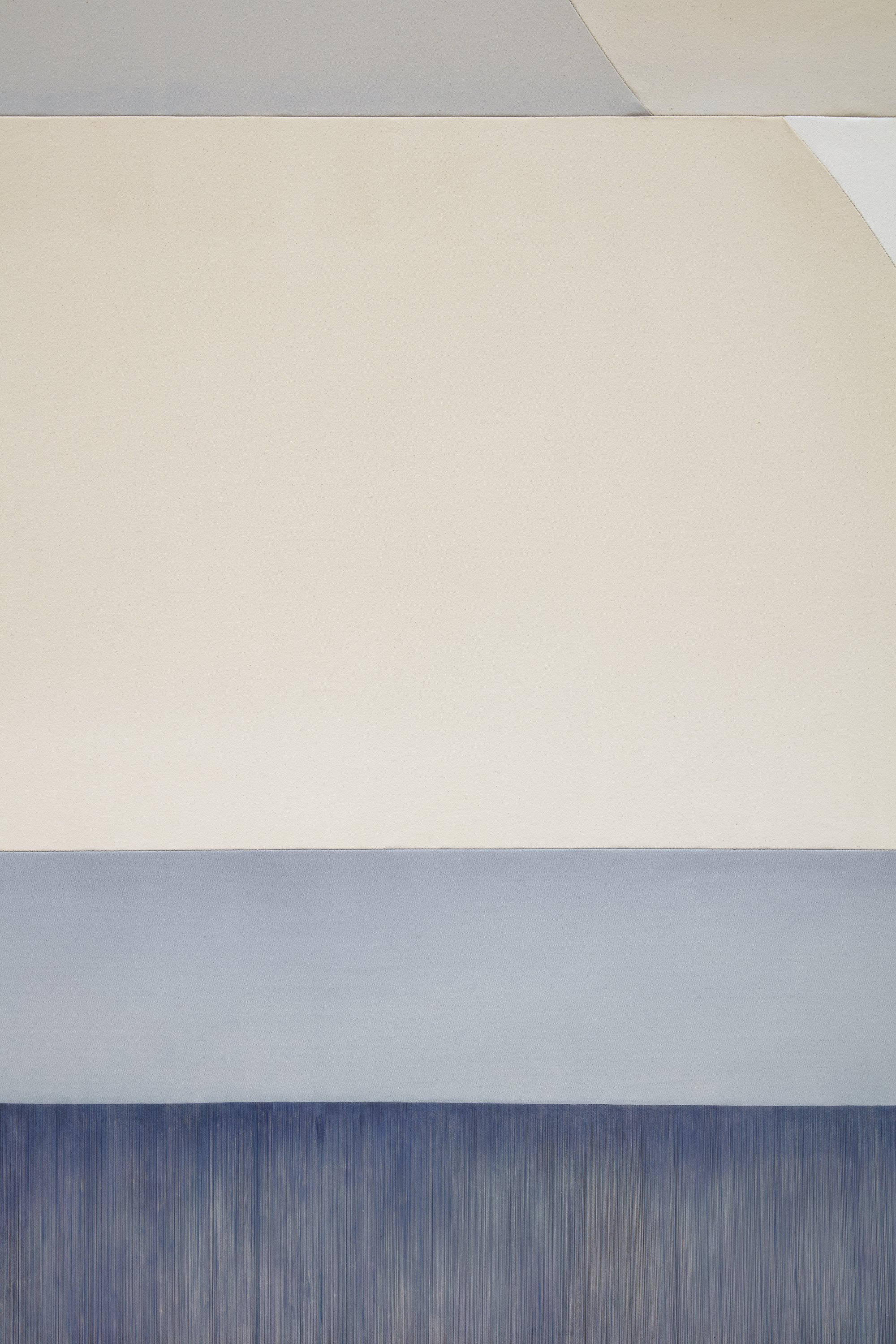
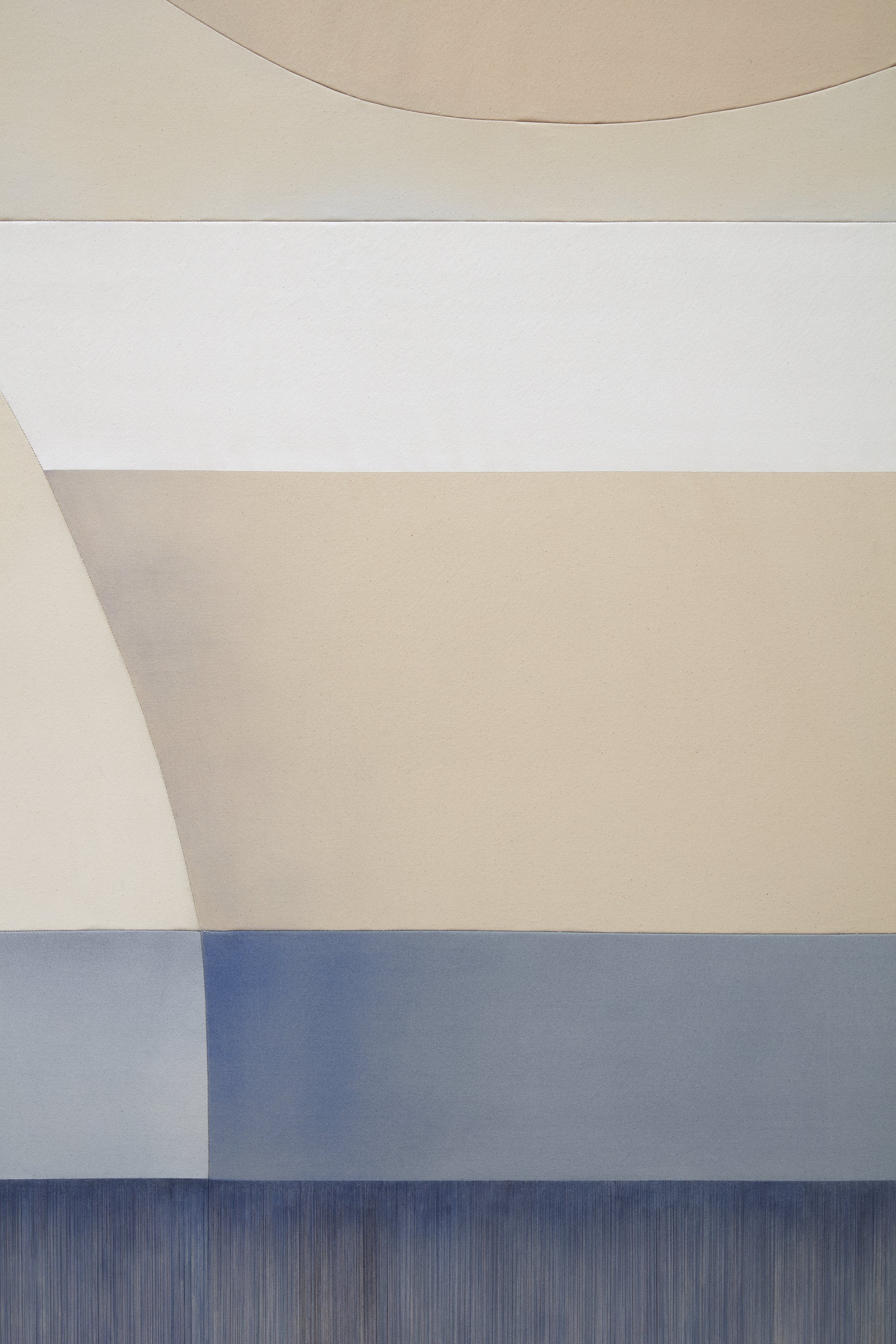
R: For this show, I found myself exploring the concept of shadows, and these works examine that idea in multiple dimensions. Shadows play a role in how a line or image recedes into space or comes into sharper focus, creating an interplay between the foreground, middle ground, and background. Each shadow shifts the viewer’s perception of dimensional space. Many of the lines don’t match up intentionally, and this is a nod to their origins as digital drawings.
For the piece open secret, for example, one layer involves the silhouettes of curved forms cast onto the strings, while the upper canvas portion displays a sewn shadow of the same curving shape. There is also a shadow that appears on the wall, created by the removal of the weft and the attachment of the warp to the frame.


Rebecca Ward soft landing, 2024 Acrylic and dye on stitched canvas 96 x 72 inches (243.8 x 182.9 cm)
U: Your use of geometry adds a fascinating technical dimension to your art. How important is math to your creative results?
R: Well, I’m definitely not a mathematician! But I’m fascinated by the idea of math as a foundational space, a starting point for everything. I used to make these tape installations when I was fresh out of college, and measurement was at the core of those works. The architecture of the space set the framework for everything I made. This approach feels similar with my canvas works. I begin with removing the horizontal threads of the canvas and then work with the grid of pattern paper to cut fabric sections to paint, all while being constrained by the measurements of the frame.
The woven canvas operates within a grid, and so do my drawings. Many of them start with an X/Y axis, which I then add curves to, allowing a bodily form to take shape—one that can shift depending on the viewer’s perspective. Many of these are based on waveforms, like light or sound. What I'm communicating is the idea of unseen forms being translated into an image. I see this fusion of the rigid grid and the fluidity of curves as a way to explore the interplay between the masculine and the feminine, creating a dynamic space where form emerges from the structure itself.
U: vector specter is your most recent exhibition at the Peter Blum Gallery. How did the idea come about for the theme of the exhibition?
R: The title of the show is a direct reference to my process, where I start by creating digital drawings before translating them into hand-crafted works. A vector is a drawing that exists in a mathematical space. A shape can become infinitely smaller or infinitely bigger. "Specter" plays on the idea of spectrums and shadows. Color and shadows emerge from the interplay of transparency and gradient. A key part of my process involves removing the threads from the canvas and revealing the underlying stretcher bars so the viewer sees the nature of the fabric itself. This exposes how fabric is woven, and unraveling canvas offers insight into that process.


Rebecca Ward sea creature, 2024 Acrylic and dye on stitched canvas and linen 96 x 72 inches (243.8 x 182.9 cm)
U: In the exhibition, vector specter includes your two most significant works to date: soft landing and sea creature. What difficulties did you face when creating the artistic idea you had in mind due to the size of each project?
R: A larger painting is always more difficult because it’s more physical. There’s not much sitting down. With these two larger works, it felt like I was working on about eight pieces instead of just two. When I’m painting, everything has to be larger than the sewn dimensions to account for the shrinkage that occurs with watercolor. So, even though the piece measured 96x72 inches, I was actually working on something closer to 120x100 inches, give or take.
The process of stretching the works can be pretty demanding. I hoist them up with vise grips, but the top can be so heavy that they have to be secured with ratchet ties to prevent it from falling. I also have to have them several feet off the ground to stretch the weft to the frame. My studio isn’t huge, so I definitely pushed the limitations of what I could manage in this space for now. It was a learning curve, and I’m just relieved I didn’t injure myself in the process! Each piece took about a month to complete, but I love the challenge of making larger works.
U: With art that intentionally blurs the lines between the tangible and the ethereal, how do you bring this effect to life in your work?
R: That is one of the great mysteries to me, and it’s something that will likely drive me for a long time. There’s a liminal, almost spiritual space that I want to tap into, though that’s difficult to achieve. The work should feel tactile and sumptuous, drawing you in and inviting engagement. It needs to have a magnetic quality, something that encourages closer inspection. As you approach it, the layers of texture, detail, and nuance should become evident. To me, the image as a whole should evoke intrigue, like a puzzle that becomes more fascinating as the pieces fall into place.
U: Can you describe how you choose colors to use in your artwork?
R: This show is largely about color, and when I first imagined the exhibition, I saw the sizes and hues of each work in every room. I wanted to pair bold, more monochromatic pieces with softer pastels, creating a balance between intensity and subtlety. This contrast was a deliberate choice, a conversation that shapes don’t inherently define sensation in the same way that color does. Color has a unique, almost visceral power to evoke emotion and response. Its impact on our senses can be immediate. At the same time, I believe that color doesn’t always convey sensation as profoundly as something like music might. In color theory, warm tones like red can stimulate energy and appetite, while cool colors can evoke calm or introspection. The title of the works hunger and hunger II speak to this. Red is known to be notoriously appetite-inducing. That resonates with me as a parent, as I’m constantly navigating the physical and emotional pull of hunger! Color taps into an instinctive place within us.
U: Your artistic practice merges painting, sculpture, and craft. Which medium fits your artistic statement the most?
R: I think "medium" is almost an outdated term. Medium implies a separation, a box that the work fits into, when in reality, the creative process and outcomes often transcend those boundaries. My goal is to find the slippage between materials, ideas, and experiences, rather than adhering to a single medium.
U: What type of statement do you want your art to make?
R: Ultimately, the act of creation feels like it can still be an act of rebellion. I believe that all forms of art-making can carry a political charge, even when the work is abstract. There's something powerful about viewing beauty as a form of resistance and resilience.
For more information about Rebecca’s artwork please visit her website here. Also, the magazine featured her latest exhibition, which can be found here.